Wednesday, June 27, 2018

Autumn for Colour INKspiration #36


Hello and Welcome to a brilliant blog hop for colour INKspiration.

Image may contain: 1 person

Our colour challenge this week is to use Crushed Curry, Soft Suede, Basic Gray and Silver Foil.


I think these colours totally match our weather at the moment here in Queensland!  They are quite Autumnal, and the photos really have a lovely rustic feeling about them.  


This is my husband's birthday card which is coincidentally today!  


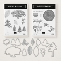
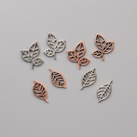
I've used the lovely Rooted In Nature suite which includes a couple of really awesome embossing leaves that you can see I've used on the Silver Foil.


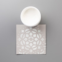
My background panel was created using the super sparkly Shimmery White Embossing Paste and the brick wall Pattern Party Decorative Mask.  I then threw some yellow Brusho over the paste while it was still wet, and spritzed a bit of water to add more intensity of colour.  I've tried to capture the super sparkliness but it's a bit tricky to try and photograph!!


You will to be totally blown away by the amazing projects from the whole design team with these colours, so make sure you keep hopping all the way around!!


Until Next Time,
Happy Stamping,
Love Julia   x


https://www3.stampinup.com/ecweb/default.aspx?dbwsdemoid=4000304

Rooted in Nature Clear-Mount BundleLeaves TrinketsMetallic PearlsBrusho Crystal ColourShimmery White Embossing PastePattern Party Decorative Masks

Sunday, June 24, 2018

Varied Vases in the Delightfully Detailed Chapter CTC#184


Hello and Welcome to a fun and wonderful challenge blog hop where we CASE the Catty.


Each Sunday we challenge you to join in the fun as we look at the Stampin' Up! catalogue with new eyes.  We Copy And Selectively Edit or Copy And Share Everything as we are inspired in many different ways by the projects illustrated on every page - what a great way to find inspiration  over and over again!!

Image may contain: 2 people, people smiling

This week, we are being inspired by the Delightfully Detailed chapter.  There is soooo much in this chapter that I just love love love love, but in the end, I took my inspiration from the great project illustrated with the Varied Vases bundle. 


This little card at the bottom of the photo was my starting point.  I really love the line up of vases - some solid and some see through - but I couldn't quite get the look I wanted!!


So, my vases all ended up being solid using the punch only and no stamping.  I've sponged the outside edges of the vases to give them some depth.  The flowers are all stamped using the beautiful 2 step stamped images.  


The bottom panel of the inspiration card had some super cool stamping at the base- which I have translated into the divine Petal Promenade DSP.  I've stamped my greeting onto one of the totally gorgeous Stitched Label framelits.  


The orientation of my card is different to the original - this was so I could have the lineup of vases in the original!!  At the end, I've only opted for the 3 and created an easel card to show off the gorgeous papers and label.  This was one of the projects at my all day Cardmaking event yesterday to celebrate the new catalogue !  Everyone loved it.  

I hope you've been inspired!!  It's so amazing where the inspiration of the catty will take you!!


Up next is the remarkable Rachael and a lovely card to get you inspired!!  Make sure you hop around the whole crew - so much to looooooove and enjoy and encourage you to have a go too!!


You can add your project to the lineup here!!

Until Next Time,
Happy Stamping,
Love Julia   x


https://www3.stampinup.com/ecweb/default.aspx?dbwsdemoid=4000304

Varied Vases Photopolymer BundlePetal Promenade Designer Series PaperPearlized Doilies

Tuesday, June 19, 2018

A Patriotic Theme for SUO


Hello and Welcome to our fun line up for SUO Challenges.  We are a design team using only Stampin' Up! products in  a fun challenge!!


This time we have a Patriotic Challenge.  And this really was a challenge for me!

Image may contain: sky, cloud and stripes

Eventually I decided to go with the traditional Australian Green and Gold and added a little splash of Night of Navy in a nod to our flag.  


I've used Granny Apple Green and Mango Melody - some really fun new colours in our Brights collection.  Don't they look just super together?  My background was created using some Brusho Inks and a watercolour wash.  After it was dry I stamped the fun confetti images from the great and super versatile stamp set Treat Time.  The greeting was created using the emboss resist technique - emboss with white embossing powder and then add a watercolour wash with ink.  It was punched using the new Darling Label Punch.


So, how did I go?  Does this suit the Patriotic guidelines?  We'd love you to join n the fun too and add your project to our lineup over on our blog.


Until Next Time,
Happy Stamping,
Love Julia   x


https://www3.stampinup.com/ecweb/default.aspx?dbwsdemoid=4000304
Treat Time Clear-Mount Stamp SetDarling Label Punch BoxEveryday Label Punch

Sunday, June 17, 2018

What a great technique in the Animal Expedition Chapter CTC#183


Hello and Welcome to our Sunday Night Blog Hop challenge CASEing the CATTY.


We are a team who love to inspire and challenge you to see the catalogue in new ways as we CASE Copy And Share Everything or Copy And Selectively Edit from the fabulous lineup in the Stampin' Up! catalogues.  

No automatic alt text available.

This week, we are exploring the Animal Expedition chapter - pages 26 - 73.


and I want to share with you some inspiration from the awesome technique shown on page 33 showing us another way to use those fabulous Stampin' Blends.


Even though the little piggys from This Little Piggy are totally super cute, I've decided to use the ever lovely Beautiful You stamp set.


This is a lovely stamp set to colour and the images are just gorgeous!!


I had 2 attempts at creating the tartan background using my Blends - the one above is more measured and rigid, and the one below I just wildly freehanded ......


and in the end I preferred the looseness of the freehand background which was more open and less intense!!  The other background seemed to overshadow the feature panel a bit too much.  I do know that some people would not be comfortable with the unevenness of my background - but I really do like it!!!  


And after you've hopped around the whole team and been inspired over and over again, add your project to our lineup on the facebook challenge page.  


Until next time
Happy Stamping,
Love Julia   x


https://www3.stampinup.com/ecweb/default.aspx?dbwsdemoid=4000304

Beautiful You Clear-Mount Stamp SetStampin' BlendsVery Vanilla Note Cards & EnvelopesVery Vanilla Solid Baker's Twine


Sweet Colours CTC#461

Hello and Welcome to Handmade by Julia Quinn Tonight I’m sharing some colour fun with the Casing the Catty Crew!!   To Case it to Copy and S...

Favourites